A while back, I decided to try to teach myself R. I thought that running races would have some interesting data to look through. Here’s what I’ve come up with so far:
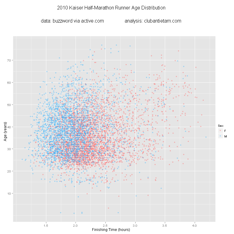
This is a scatter plot of finishing times versus runner ages with different colors for male and female runners:
Males generally finished the race faster. There were more female runners (I wonder why?). The fastest age group looks to be runners in their mid 20s. There are a few data points where I’m guessing no age was given and therefore the runner was assigned the age of “1”. I’m impressed at the people who are still completing half marathons in their 60s and 70s!
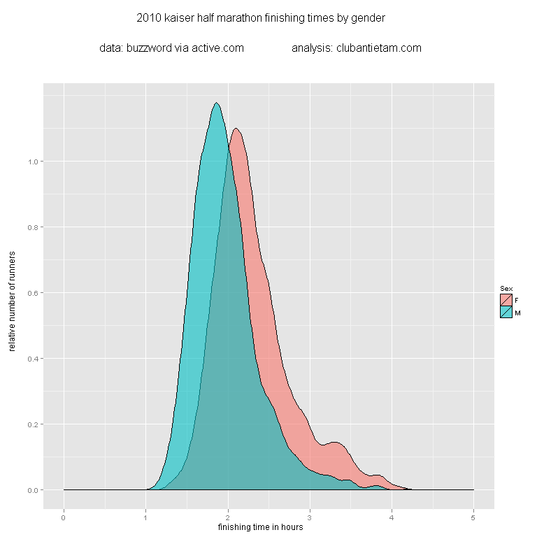
More charts to come, maybe!


An exciting new direction for this blog! Looking forward to interesting charts and graphs.
very cool!