ALC letterpress card update


Here’s a little update on the ALC cards:

I bought a bunch of paper from dick blick in berkeley.  I forgot what type I got now, but I got the heaviest printmaking paper that seemed reasonably priced.  Registration can be a bit tough with the quickutz L letterpress.  It didn’t help that the cards aren’t exactly uniform in size – that’s a lesson learned for next time.  If the cards were uniform in size, I would have been able to use the edges to register the print.


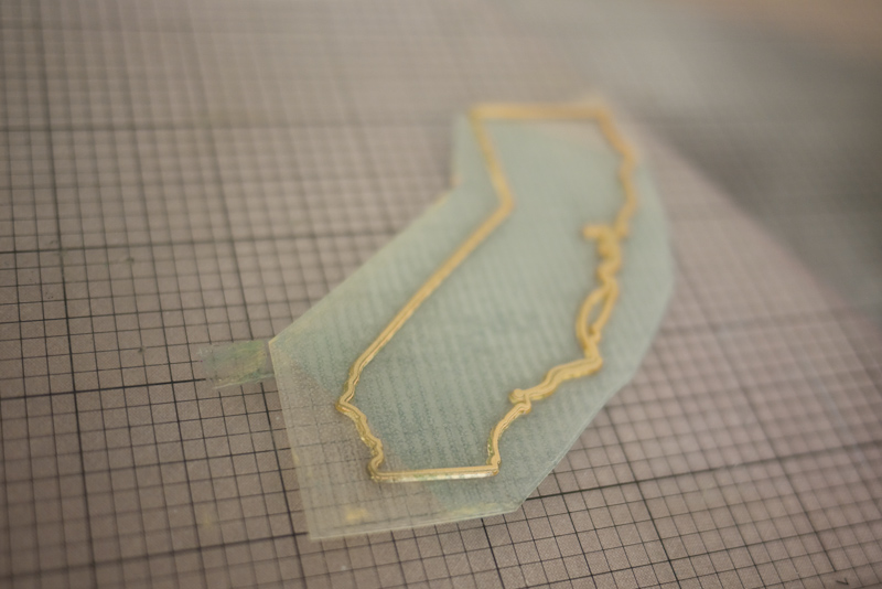
The Boxcar plates continue to be nice.  I traced this outline of the state of California in Illustrator and added a little SF to LA route.


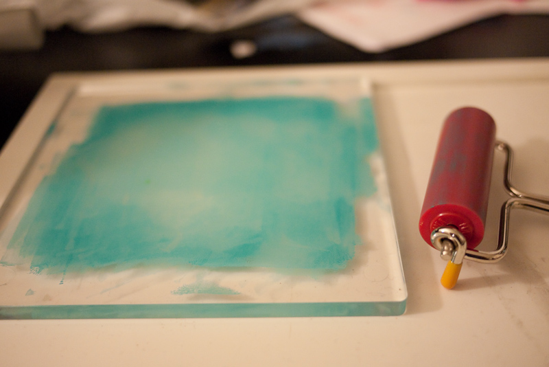
I took Boxcar’s advice and got a soft rubber brayer.  I bought a 6″ speedball one from dick blick.  I probably needed a slightly larger one for what I’m doing, but the soft rubber makes a huge difference in the uniformity of the ink application.  A wider brayer would have helped even more because I wouldn’t have had to ink the plate in multiple passes.


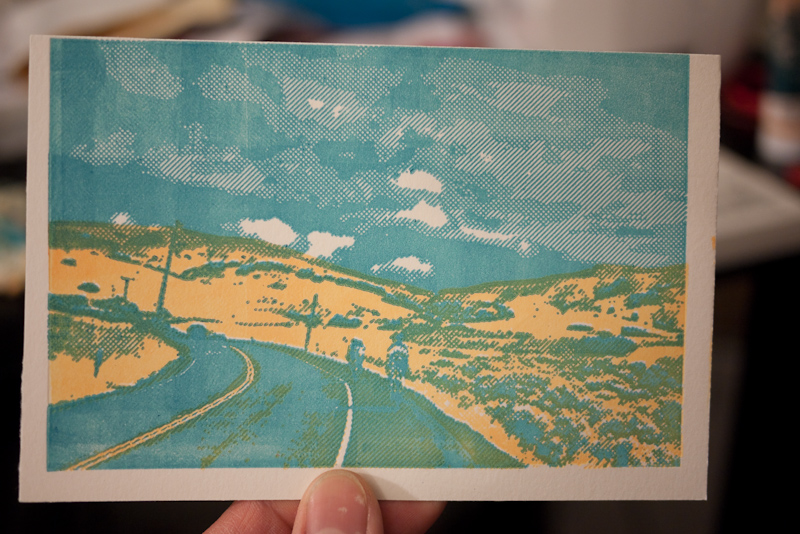
Here’s the front side of a card that’s registered pretty well.  Next time I’ll try to make better use of the cross-hatching – I think the hatching is one of the fun things about these types of designs.


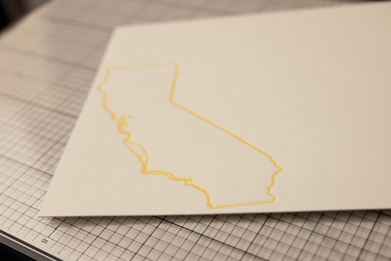
An outline of the state of  California on the back side of the card


I used one of the elum thank you plates and added my own bicycle icon.


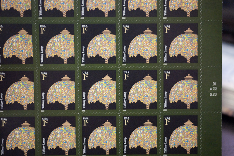
I find it absolutely hilarious (and awesome) that the 1 cent USPS stamps are of a tiffany lamp.


AIDS LifeCycle cards, the L letterpress Epic, and plates from Boxcar press

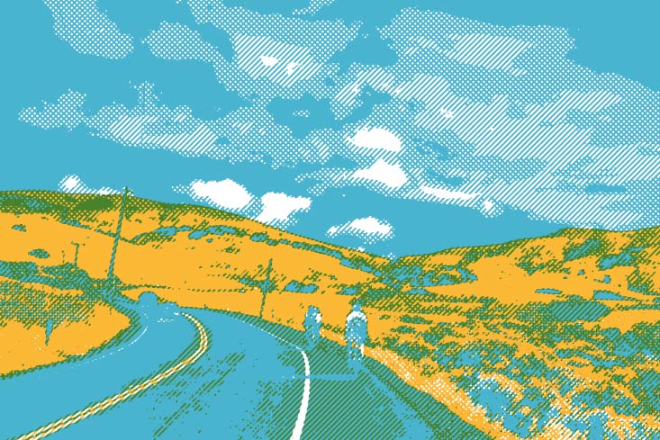
I received the Epic combo kit from Lifestyle Crafts for my birthday and I thought it’d be a cool AIDS LifeCycle fundraising idea to create some custom plates based on my photography.  Designing and creating the artwork took much longer than expected, but I ended up choosing to create something based on this photo that I took from a ride last month:

I decided to create a 2-color print.  I did the color separations in Photoshop and then used Illustrator to create some cross-hatching patterns to give the image a more interesting texture.  It took a long freaking time (I used Illustrator’s live trace.  This was nice, but created a bunch of paths and points.  When I compounded that with the cross hatching swaths, there were even more paths and points.  This made it hard and slow to edit.)


Here’s a preview of what I expected things to look like:


I ordered plates through boxcar press and received them this past week.

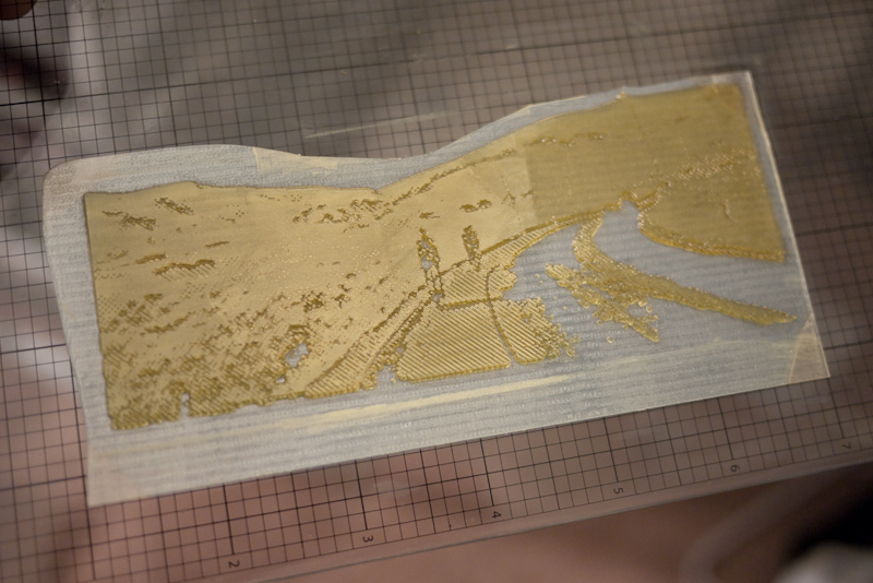
The above photo is of one of the plates from Boxcar press.  It’s a flexy plastic material with a bit of hardness to it.  This one is partially inked with the yellow/orange speedball block printing ink that I had purchased.  I was surprised at the resolution that the plates could handle.


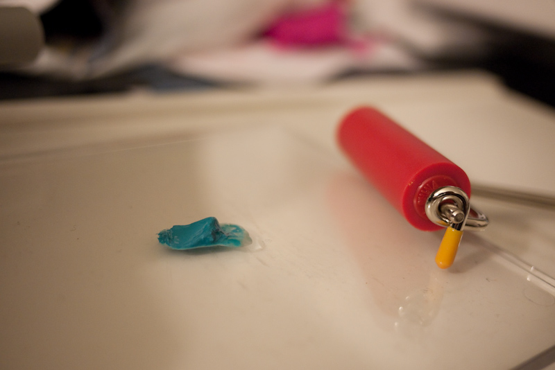
above:  Brayer, with ink.


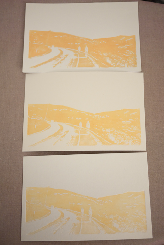
I tried varying amounts of ink to see what would look better on paper:


above: blue ink for the second plate


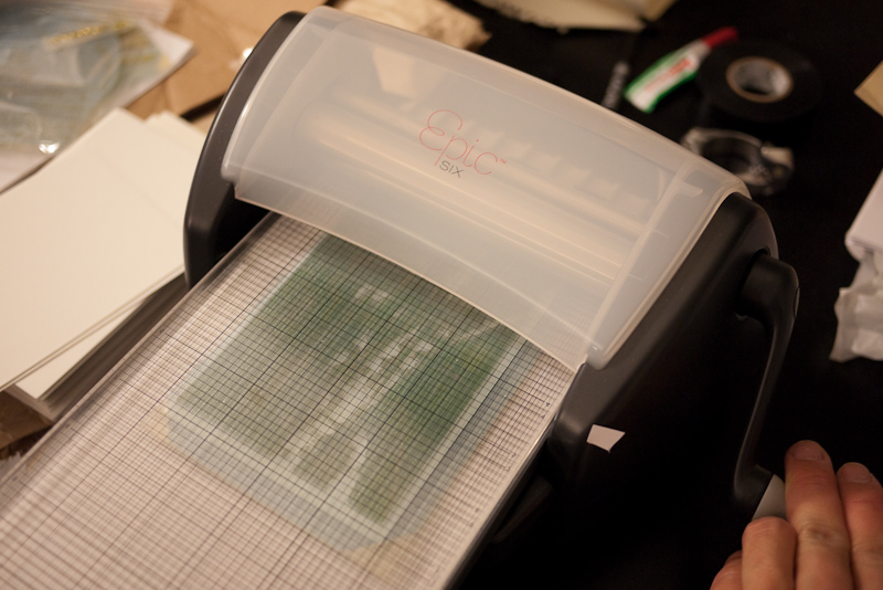
above: This is what it looks like when you run a plate through the press.  It’s basically some rollers that apply a lot of pressure to the paper and the plate.


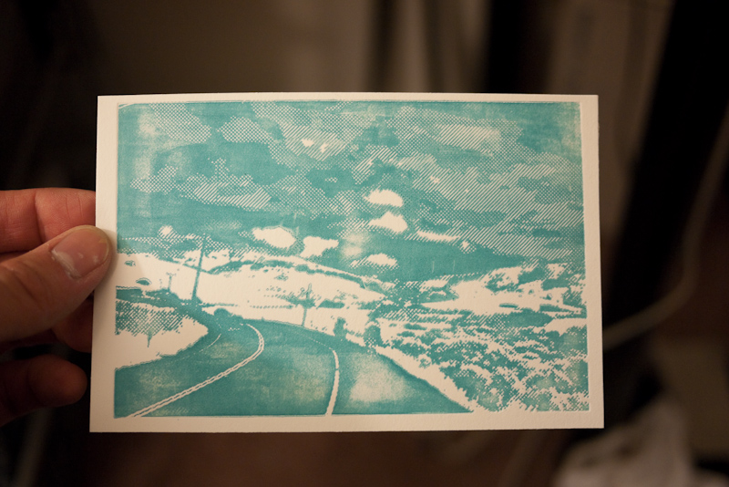
above: an unevenly inked blue but still pretty cool


I didn’t have enough time to play around too much,  but here are some of the prototype cards:

I think I’ll make sure there’s more ink coverage for the next set.