How bumpy is my baby’s ride in my jogging stroller?

Stroller bumpiness, measured with an iPhone accelerometer

When our daughter was younger, I tried to quantify the "bumpiness" of her rides in strollers.  We had two strollers, an older Bugaboo Bee (can't find a link to the older version) and a Thule Chariot Cougar (single, not double).  We had the normal stroller attachment for the Chariot Cougar and the jogging attachment. 

Bugaboo bee
Thule Chariot Cougar with stroller wheels
Thule Chariot Cougar with jogging attachment

In addition to comparing the differences between strollers, I wanted to compare the "bumpiness" differences when walking and running.

Data collection was messy, as you'll see below, but hopefully the results are still interesting.

Measurements and Methods

I used an old iPhone 4S with an data logging app to measure its accelerometer output while the phone was placed in the bottom basket of the Bugaboo and in one of the front pockets of the Thule Chariot Cougar.

I used two different apps to record the data:

  • Axelerom: For measurements of the Bugaboo and the Thule Chariot Cougar with stroller wheels
  • xSensor: For measurements of the Thule Chariot Cougar with the jogging attachment

Both only recorded data when the phone screen was on, so I had to stop once and a while to make sure it was still recording.  The Axelerom readings were taken at 5Hz and the xSensor at about 19-20Hz.  The Axelerom readings were also somehow strangely rendered out of order in the data file.  I had to resort the data by timestamp.

Upon analyzing the data, I realized that 5Hz wasn't fast enough to do anything other than measure acceleration.  Even the xSensor measurements at 19Hz weren't that great.  This was a bit of a problem, because I couldn't reliably measure the "jerk", or the rate of change of the acceleration.  The jerk can have a large impact on the perceived quality of a ride.  A good analogy is the difference between slowing down in a car at an intersection and abruptly letting off on the brake when the car comes to a stop rather than gently easing off of the brake pedal.

Coincidentally, I learned during research that 5Hz is roughly the resonant frequency of important parts of the body, and possibly the least comfortable vibration frequency to experience.

The measurements were taken on the sidewalks and streets in Oakland, California, mostly along the same ones for each stroller.  I didn't take the exact same path or streets for each stroller though, so this is another potential source of variation.

The smoothest ride was with the Thule Chariot Cougar

Stroller bumpiness, measured with an iPhone accelerometer

The Thule Chariot Cougar looks like a SUV next to the Bugaboo Bee stroller.  It's got two 20" wheels with pneumatic tires and a suspension on the back.  The Bugaboo's wheels are suspended too, but are much, much smaller.

One can observe the difference in forces measured in the stroller on the graph: the pointier the curve, the smoother and less bumpy the ride.

The numbers

The Thule Chariot Cougar with the stroller wheels (in green in the chart above) provided the smoothest ride, with a minimum measured acceleration of 0.399 Gs and a maximum acceleration of 2.231 Gs.  The standard deviation was 0.108 Gs.

The Bugaboo Bee was the next smoothest, with a minimum measured acceleration of 0.087 Gs (nearly freefall, for a split-second at least!)  and a maximum measured acceleration of 2.452 Gs.  The standard deviation was 0.165 Gs.

As one may expect, the bumpiest ride was with the Thule Chariot Cougar with the jogging attachment, recorded while running.  I regret that I did not perform measurements while just walking with the jogging attachment installed to have that as a point of comparison.  The minimum measured acceleration was 0.089 Gs, the maximum measured acceleration was 2.382 Gs, and the standard deviation was 0.242 Gs.

What does this all mean?

It was really interesting to find that the maximum and minimum recorded accelerations for the Thule Chariot Cougar with jogging attachment, while jogging, was similar to that of the Bugaboo Bee.  And the Bugaboo Bee is a pretty smooth rolling stroller.  I found that to be pretty reassuring.  Though the ride while jogging was definitely bumpier, the maximum acceleration magnitude was smaller than that of the Bugaboo.

This was kind of just a fun exercise, but there are a couple of conclusions I came to:

  • The Thule Chariot Cougar is a very smooth-riding stroller.
  • Running with the Cougar's jogging attachment is sorta bumpy, but probably not way worse than the Bugaboo Bee.


Where are bikes stolen? Neighborhoods and cities where bikes are reported as being stolen from on Craigslist

Scroll down for bigger images and an explanation.


Update: Links in the Huffington Post, SF Gate, Mission Mission, The Tender and Mission Loc@l.

This is part 2 of an analysis of postings reporting stolen bikes on Craigslist.  Part 1 is here.

Bike theft sucks.  What can we learn about it?

Bike theft sucks.  If your bike is stolen, not only will you have lost a fairly significant possession, but there’s a good chance you’ll be stranded or stuck if you use your bike as a mode of transportation.  (If you’re looking for tips on how to avoid having your bike stolen, try the San Francisco Bike Coalition’s page on theft prevention.)

I was curious about how bike thefts occur and what kind of patterns there were in bike theft incidents.  To do this, I turned to Craigslist, where occasionally while looking through listings for used bikes, I’d stumble upon a post where someone would plead for their bike to be found and returned.  Or I’d see a post where someone would promise revenge if the thief is ever found on their bike.  So, to get a better idea of what was happening with stolen bikes and Craigslist, I gathered some data.

Gathering and processing data

I archived San Francisco Craigslist listings from July 2nd, 2011 til October 17th, 2011 in the “bicycles” section with “stolen” in the title. This includes listings all over the Bay Area – San Jose, Mountain View, Oakland, Berkeley, San Leandro, Santa Cruz and so on.  This is only about 3 months of data, but I think it’s fairly representative.

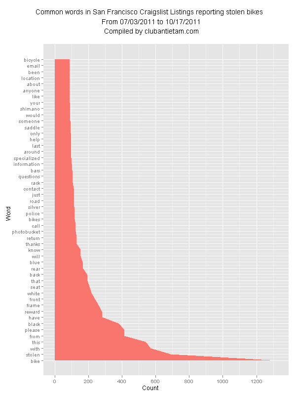
The first part of my analysis was a simple graph with word counts for an aggregate of the postings.   It showed that there was a tendency for people to post about bikes (obviously) with pleas for help.  Shimano components and Specialized bikes dominated the listings.  Black was the most popular color in the posts.

I was also curious about the geographical distribution of stolen bikes.  If you were to park your bike somewhere, in which neighborhood is it more likely to be stolen?  Which city has more stolen bikes?  I took the big group of postings and converted the data format to a spreadsheet and then used software to make a treemap and then manually cleaned up the graphic and tried to make it a little prettier.    (If you care for details: I created a Google Reader feed back in July, exported the feed to XML, cleaned up the data and exported to CSV using Google Refine, then used R and the map.market function in the portfolio package to create an image.  I then used Adobe Illustrator to make things a bit more attractive and readable.  Flowing Data’sAn Easy Way to Make a Treemap” was very helpful in this process.  If I had known how to code in R better, I would probably have tried to modify map.market to create a more refined treemap and remove some of the manual steps.)

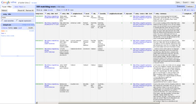
Above: Google Refine converted postings into a tabular format.

I settled on a treemap as a format to display the data, but I think a geographical map would have been the best way to represent the data.  I guess I just wasn’t up for tracing neighborhood boundaries and all of the other associated work.

I should also note that going through the listings made me kind of sad.  Bike thieves suck.

How good is the data?  Can it be refined?

Analyzing Craigslist postings isn’t a perfect way to determine where bikes are stolen.  There are a few registries out there that may have some good data.  I was curious about Craigslist postings specifically since I had stumbled across so many while shopping around for bikes for myself.

So, for a point of data from Craigslist to show up correctly in this analysis, someone who had their bike stolen would need to:

1) report a missing bike as stolen on Craigslist

2) identify the neighborhood where the bike was stolen in the posting properly

There were 633 postings in total with the word “stolen” in the title.  It seems that most people do 2) pretty well.  Only about 9% (59 of 633) of the  postings did not have an actual location in the title.  I don’t know how many people who have had their bikes stolen actually post on Craigslist and report their bikes as stolen.  I’m pretty sure it’s not all people.

Duplicates were removed

Some people are really good at posting on Craigslist though.  They posted multiple times.  This is totally understandable for someone who wants to get their bike back.  I used Google Refine to remove these duplicates so that they would not skew the data, but I probably ended up removing some unique posts in the process.  All in all, 64/633 were removed because they were duplicates.

“Stolen” is a bike company name

There’s a company that builds BMX bikes that is named “Stolen.”  I removed some, but I think about 19/633 made it into the infographics that weren’t actually stolen.  In an interesting ironic twist,  1 posting was for a stolen “Stolen” brand BMX bike.

The way people post locations can vary

Since anyone can post almost whatever they want on Craigslist, the data was pretty messy.  Craigslist has created a bunch of predefined neighborhoods such as the “Mission District” and “Hayes Valley,” but sometimes people don’t stick to the naming convention.  Sometimes people are ambiguous with neighborhood names and post “Mission” instead of the “Mission District.”  Some other people are much more specific – they post “Near Mission Cliffs” or a specific intersection like “Stockton and North Point.”  For the most part, I didn’t convert these to their applicable neighborhoods unless the poster’s intent was obvious, like with typos, for example.

Some people did not include a location or included not very useful but understandably frustrated-sounding “locations” such as, “you tell me” and “can you find it?”  Other locations contained text like, “United States” and “The Bay Area.”  I grouped these ambiguous “locations” into their own category.  They are still included in the infographics below.

Also, some listings contained locations covered by other local Craigslist websites.  “Sacramento,” for example, has its own Craigslist page, but a posting was still filed under the San Francisco Bay Area Craigslist page.

Good Samaritans also post

There were some postings from people who saw or purchased possibly stolen bikes and were trying to reunite them with their owner.  (The Laney College Flea Market in Oakland is a good place to find your bike if it’s been stolen, by the way.) This is good for the world, but it clouded the data set just a little bit.  I don’t know exactly how many postings were of this type but it was not too large of a number.  I’d estimate about 5% of postings were from good Samaritans.

Where does bike theft occur?

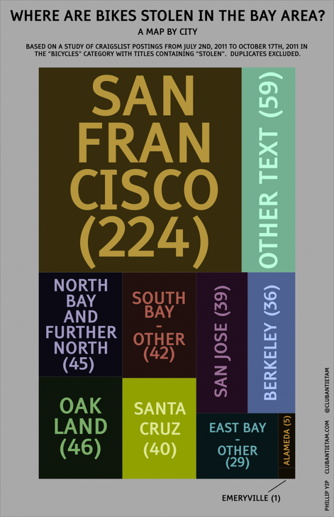
So, with all of that out of the way, here are the infographics with treemaps.   The size of a rectangle is proportional to the number of occurrences for that location.  Larger rectangles mean more bikes were reported as stolen, and smaller rectangles mean the opposite.

The first infographic is a treemap, with postings separated by city:

Interestingly, nearly half of the stolen bike postings were from San Francisco.  I expected to see more theft in Oakland and Berkeley.  It’s also surprising that there was only 1 reported theft in Emeryville.  Is it because Emeryville is that much smaller?  Are there not many cyclists there?

Workflow note: I made this treemap manually in Illustrator based on the neighborhood map below.  Open the image in a new window to view at full resolution.

Which neighborhoods?

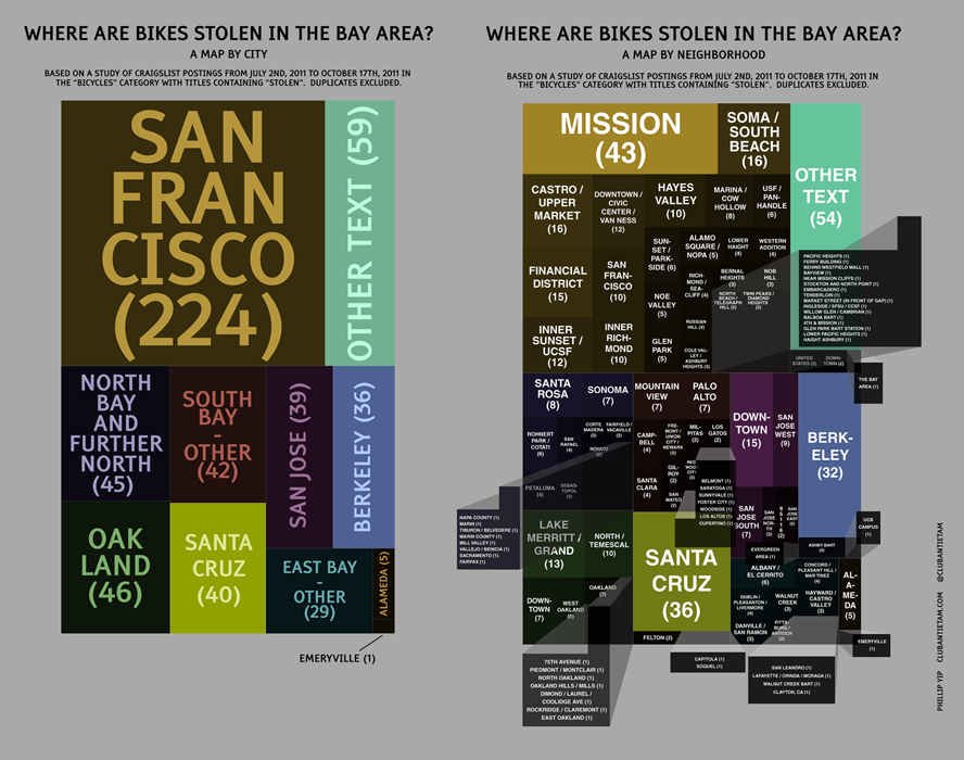
This second infographic is also a treemap, but with areas divided by cities and neighborhoods.  You’ll notice that they are color coded with the same hue as in the above city infographic.

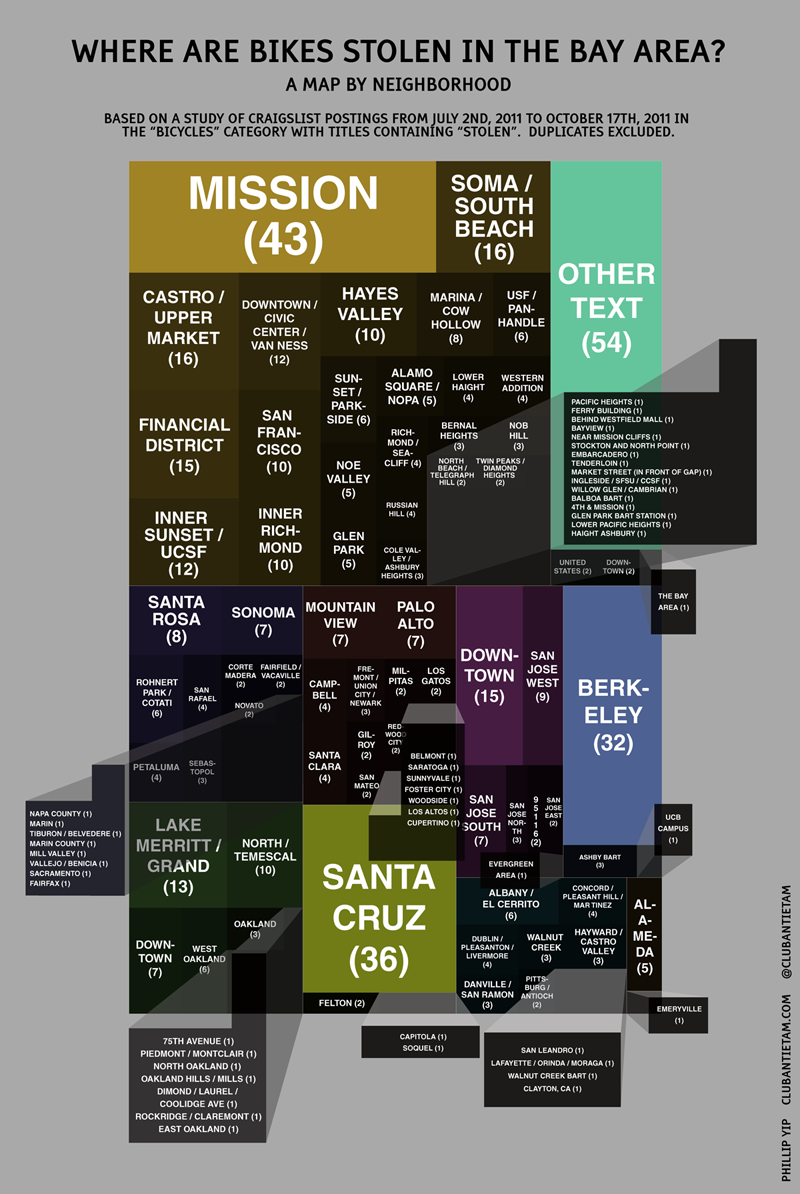
Holy crap, there are a lot of neighborhoods.  The Mission district wins for being the neighborhood with the most stolen bike listings.  In Oakland, the largest chunk of thefts occurred by the Lake.  There’s a pretty large number of stolen bikes in Santa Cruz and Berkeley, probably due to high bike usage by college students and perhaps naïveté with regards to bike locking strategies.  Strangely, there aren’t a lot of listings from Palo Alto or Stanford.  Is there less theft there or do people just not look to Craigslist when trying to recover their bike?

What’s next?

I like how they turned out, but making these damned infographics took a lot of time.  I think there’s still some interesting stuff to get out of the dataset.  I’m curious about how bikes are stolen.  Did somebody cut through a lock?  Did they break into an apartment?  Did somebody just lean their bike and then look away for a few seconds?  I’ll try to find that out next.

– Phillip Yip


Common words used in San Francisco Craigslist listings reporting stolen bikes

This is part 1 of a multi-part series.  Part 2 is here.

Bike theft sucks.  For quite some time, I’ve been wanting to compile some stats on bike theft in order to understand how and where it happens and how it can be prevented.  I archived San Francisco craigslist listings from July 2nd, 2011 til October 17th, 2011 in the “bikes” section with “stolen” in the title. This includes listings all over the Bay Area – San Jose, Mountain View, Oakland, Berkeley, San Leandro, and so on. I was curious about how bikes get stolen and what kind of patterns there were in the posts and incidents. I’ve compiled a little graph that shows the frequency of words in the listings.  I used a messy combination of Google Refine, Google Spreadshets and Open Office Calc and a word frequency counter that was a bit slow but quite useful.  The data consists of about 633 entries.

We’ll see what other data I can squeeze out of the set in the future.

I had to do some manual cleaning of the data – I purposely omitted words under 4 letters in length, like “the”, “a” and so on, since they probably wouldn’t have been too informative.  There were also various html-related words like “http”, “href” and “nofollow” that I removed as well.

Here’s a graph of the word counts:


and here’s the corresponding table:


word count
bike 1326
stolen 690
with 570
this 542
from 414
please 413
black 384
have 283
reward 280
frame 259
front 240
white 219
seat 206
that 196
back 191
rear 169
blue 167
will 154
know 153
thanks 130
return 129
photobucket 123
call 123
bikes 120
police 119
silver 116
road 115
just 115
contact 113
rack 107
questions 106
bars 105
information 101
specialized 99
around 99
last 97
help 97
only 95
saddle 94
someone 92
would 91
shimano 91
your 90
like 90
anyone 90
about 90
location 89
been 89
email 88
bicycle 88

some interesting things:

A lot of the terms are fairly obvious, but some words stick out.  Most of the posts are obviously requests for help and the words show this – “please”, “reward”, “thanks”, “return”.  As far as bike companies go, it appears that “shimano” dominates the component world and “specialized” is the most popular bicycle manufacturer.  The color “black” is the most popular, but “white”, “blue” and “silver” also show up.  Another word that stands out is “photobucket”, the popular image-sharing site.

I’m going to try to continue poring over this data and see if anything else interesting emerges.

data analysis: flying from san francisco to new york

May 10, 2013: Updates!

CheapAir.com has performed a similar analysis and created a graph that I think looks similar.  The peaks and valleys have been smoothed out because they’ve got a lot more data to average out.  For domestic flights, the average cheapest flight is 49 days prior to departure.  This is earlier than my graph, but I didn’t start my analysis nearly as early as they did.  Clicking the graph links to their informative post.

average-airfare-2012 via cheapair.com

I also found a study by ARC (Airlines Reporting Corporation) via marketplace.org that created a very similar looking graph to that of CheapAir.com’s, but from a different set of data.

airfaresweetspot via marketplace.org

Data Analysis: Flying from San Francisco to New York – when is the cheapest time to buy tickets?

Kayak.com has this nice feature where you can subscribe to price alerts for certain itineraries.  This is helpful as fares change fairly frequently and it’s hard to know when to purchase tickets.  Microsoft purchased a company called farecast.com back in 2008, which originally grew by using data to predict when prices would rise, fall, or hold steady.  Microsoft has since integrated into bing travel.  They claim about a 75% accuracy.

I visited New York a few weeks ago, and when searching for a ticket, I decided that I didn’t really trust bing travel’s technology.  I decided that I’d monitor fares on my own using Kayak’s emailed price alerts, and then make a purchase when prices seemed to be reasonable.  I identified travel dates for a round trip where I’d depart on June 17th at any time of the day and return June 21st, at any time of the day.   San Francisco International Airport (SFO) and Oakland International Airport (OAK) are both just about as easy to get to for me.  It also didn’t matter whether I arrived at John F. Kennedy International (JFK) or LaGuardia (LGA) in New York.

I took the prices from all of the emails, put them together in a data set, and plotted them.  One of the big assumptions here is that the travel dates are fixed – if you’re able to fly on different days, you’ll of course most likely be able to find cheaper tickets.

but first, key findings:

* Prices go up at the last minute.  In this case, they almost doubled.
* In the 6-week monitoring period, the cheapest flights were found about 3 weeks prior to departure
* There seems to be some truth to prices being lower mid-week
* There doesn’t seem to be a big price difference for OAK vs SFO or JFK vs LGA
* When one airline dropped fares, others seemed to follow

onto the graphs:

when should I buy tickets?

One interesting finding is that buying early (I am speaking relatively here as I didn’t start my search until about 6 weeks before departure) isn’t always the cheapest.  In this case, the cheapest fares were found about 3 weeks prior to departure.  Tickets may have, of course, been cheaper prior to 6 weeks before departure.

An ABC News article states that “Airfare sales tend to occur early in the week … And increases tend to occur at the end of the week.”  My data set isn’t very large, but here’s a histogram of prices, grouped by day of the week:

What does the histogram show?  For my set of data, the cheapest prices occurred on Wednesday and Thursday.  You can see the little bumps of lower fares on the left side of the graph for Wednesday and Thursday.  I’m not sure if much can be made of the rest of it – there aren’t too many data points to draw any strong conclusions.

Prices were probably also the highest Tuesday-Thursday because those were the last 3 days before the flight and as can be expected, last-minute tickets were much more expensive.

where should I fly from/to?

I had two theories about the relationship between airfare and the size of the airport.  I was thinking that flights might be cheaper out of SFO since it’s a much more popular airport (Based on what I could find here and here, they handled about 45 million passengers in 2010 compared to about 9.5 million for OAK).  Conversely, I also thought that flights may be cheaper out of OAK since I know that a strategy of low-cost carriers like Southwest, JetBlue, and AirTran is to use secondary airports in larger markets (think Midway for Chicago, BWI for DC, Providence for Boston, and Love Field for Dallas) to keep costs down and thus offer lower fares.

There doesn’t look to be a big price difference, on average.  There’s a piddly $4 to $6 difference between flying out of SFO vs OAK and landing in JFK vs LGA.  Maybe the two theories are both correct.  Or incorrect.  Also, the Kayak data doesn’t include Southwest, since Southwest doesn’t make its data available to third parties.

why did prices drop?

The lowest price I encountered was on May 25th, when United/Continental dropped their prices for a nonstop flight from SFO to JFK to $319 from $549 a day earlier.  American and Delta also lowered their prices for nonstop flights that day to $439 and $359.  Some of the airlines also lowered their prices from SFO to LGA (note: no nonstop flights).  This may have been because the price of connecting flights was reduced and the SFO to LGA and SFO to JFK trips share similar legs.  Interestingly, flights out of OAK didn’t change by much when prices of flights from SFO dropped by over $200.  These prices didn’t last long – the $319 fare was available for only two days.  $319 seems like a pretty good deal.  I don’t have historical flight price data, but from what I can recall, this appears to be near the bottom of the fare range.

There was another temporary price drop from SFO to LGA offered by Delta on May 31st to $341.  Prices were back up by the next day.

parting words

If you’ve made it this far, thanks for reading.  I’ve been wanting to get more into data analysis on topics that we all can relate to and this is part of my foray into the field.  There’s a lot more to learn and study out there, so if you have any suggestions of things I should look into regarding airfares or anything else, let me know.

When my schedule freed up, I ended up changing my travel dates in order to find flight times that worked better for me and found two nonstop flights from SFO to JFK on Virgin America.


playing with data: the 2010 kaiser half marathon

A while back, I decided to try to teach myself R.   I thought that running races would have some interesting data to look through.  Here’s what I’ve come up with so far:

This is a scatter plot of finishing times versus runner ages with different colors for male and female runners:

Males generally finished the race faster.  There were more female runners (I wonder why?).  The fastest age group looks to be runners in their mid 20s.  There are a few data points where I’m guessing no age was given and therefore the runner was assigned the age of “1”.  I’m impressed at the people who are still completing half marathons in their 60s and 70s!

More charts to come, maybe!