How bumpy is my baby’s ride in my jogging stroller?

Stroller bumpiness, measured with an iPhone accelerometer

When our daughter was younger, I tried to quantify the "bumpiness" of her rides in strollers.  We had two strollers, an older Bugaboo Bee (can't find a link to the older version) and a Thule Chariot Cougar (single, not double).  We had the normal stroller attachment for the Chariot Cougar and the jogging attachment. 

Bugaboo bee
Thule Chariot Cougar with stroller wheels
Thule Chariot Cougar with jogging attachment

In addition to comparing the differences between strollers, I wanted to compare the "bumpiness" differences when walking and running.

Data collection was messy, as you'll see below, but hopefully the results are still interesting.

Measurements and Methods

I used an old iPhone 4S with an data logging app to measure its accelerometer output while the phone was placed in the bottom basket of the Bugaboo and in one of the front pockets of the Thule Chariot Cougar.

I used two different apps to record the data:

  • Axelerom: For measurements of the Bugaboo and the Thule Chariot Cougar with stroller wheels
  • xSensor: For measurements of the Thule Chariot Cougar with the jogging attachment

Both only recorded data when the phone screen was on, so I had to stop once and a while to make sure it was still recording.  The Axelerom readings were taken at 5Hz and the xSensor at about 19-20Hz.  The Axelerom readings were also somehow strangely rendered out of order in the data file.  I had to resort the data by timestamp.

Upon analyzing the data, I realized that 5Hz wasn't fast enough to do anything other than measure acceleration.  Even the xSensor measurements at 19Hz weren't that great.  This was a bit of a problem, because I couldn't reliably measure the "jerk", or the rate of change of the acceleration.  The jerk can have a large impact on the perceived quality of a ride.  A good analogy is the difference between slowing down in a car at an intersection and abruptly letting off on the brake when the car comes to a stop rather than gently easing off of the brake pedal.

Coincidentally, I learned during research that 5Hz is roughly the resonant frequency of important parts of the body, and possibly the least comfortable vibration frequency to experience.

The measurements were taken on the sidewalks and streets in Oakland, California, mostly along the same ones for each stroller.  I didn't take the exact same path or streets for each stroller though, so this is another potential source of variation.

The smoothest ride was with the Thule Chariot Cougar

Stroller bumpiness, measured with an iPhone accelerometer

The Thule Chariot Cougar looks like a SUV next to the Bugaboo Bee stroller.  It's got two 20" wheels with pneumatic tires and a suspension on the back.  The Bugaboo's wheels are suspended too, but are much, much smaller.

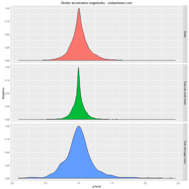
One can observe the difference in forces measured in the stroller on the graph: the pointier the curve, the smoother and less bumpy the ride.

The numbers

The Thule Chariot Cougar with the stroller wheels (in green in the chart above) provided the smoothest ride, with a minimum measured acceleration of 0.399 Gs and a maximum acceleration of 2.231 Gs.  The standard deviation was 0.108 Gs.

The Bugaboo Bee was the next smoothest, with a minimum measured acceleration of 0.087 Gs (nearly freefall, for a split-second at least!)  and a maximum measured acceleration of 2.452 Gs.  The standard deviation was 0.165 Gs.

As one may expect, the bumpiest ride was with the Thule Chariot Cougar with the jogging attachment, recorded while running.  I regret that I did not perform measurements while just walking with the jogging attachment installed to have that as a point of comparison.  The minimum measured acceleration was 0.089 Gs, the maximum measured acceleration was 2.382 Gs, and the standard deviation was 0.242 Gs.

What does this all mean?

It was really interesting to find that the maximum and minimum recorded accelerations for the Thule Chariot Cougar with jogging attachment, while jogging, was similar to that of the Bugaboo Bee.  And the Bugaboo Bee is a pretty smooth rolling stroller.  I found that to be pretty reassuring.  Though the ride while jogging was definitely bumpier, the maximum acceleration magnitude was smaller than that of the Bugaboo.

This was kind of just a fun exercise, but there are a couple of conclusions I came to:

  • The Thule Chariot Cougar is a very smooth-riding stroller.
  • Running with the Cougar's jogging attachment is sorta bumpy, but probably not way worse than the Bugaboo Bee.


graph: when are bikes faster than airplanes

After a group of cyclists (and someone on public transit and a rollerblader) beat a jetblue plane from burbank to long beach this past weekend during carmageddon, Nadia Korovina did a little analysis on Bike Commute News and came up with a simple equation to find the maximum distance at which traveling by bike is faster than traveling by plane:


 (Nadia, is that LaTeX? I’m impressed)

In the blog post, Nadia and Jordan found that the maximum distance where a bike is faster than a plane, assuming a 2.5 hour delay (including time standing in line, security, waiting, transport to and from the airport), 25mph average cyclist speed (those @wolfpackhustle guys can hustle), and an airplane speed of  500mph.


Some commenters wondered how things would work out for someone who rides a bit slower, and someone else asked about graphs.


so, here you go:


A bike traveling at 20mph would travel 52.1 miles before being passed by the jet.  At 15mph, this distance is 36.7 miles, at 12.5mph, this distance is 32.1 miles, and at 10mph, this distance is 25.5 miles.  The jetblue thing was definitely a bit of a stunt – I don’t think many people would expect a plane to be too efficient for a 40-mile commute, but this whole #flightvsbike thing goes a long way in showing the viability of using a bike for an everyday trip.  good work, all.


data analysis: flying from san francisco to new york

May 10, 2013: Updates!

CheapAir.com has performed a similar analysis and created a graph that I think looks similar.  The peaks and valleys have been smoothed out because they’ve got a lot more data to average out.  For domestic flights, the average cheapest flight is 49 days prior to departure.  This is earlier than my graph, but I didn’t start my analysis nearly as early as they did.  Clicking the graph links to their informative post.

average-airfare-2012 via cheapair.com

I also found a study by ARC (Airlines Reporting Corporation) via marketplace.org that created a very similar looking graph to that of CheapAir.com’s, but from a different set of data.

airfaresweetspot via marketplace.org

Data Analysis: Flying from San Francisco to New York – when is the cheapest time to buy tickets?

Kayak.com has this nice feature where you can subscribe to price alerts for certain itineraries.  This is helpful as fares change fairly frequently and it’s hard to know when to purchase tickets.  Microsoft purchased a company called farecast.com back in 2008, which originally grew by using data to predict when prices would rise, fall, or hold steady.  Microsoft has since integrated into bing travel.  They claim about a 75% accuracy.

I visited New York a few weeks ago, and when searching for a ticket, I decided that I didn’t really trust bing travel’s technology.  I decided that I’d monitor fares on my own using Kayak’s emailed price alerts, and then make a purchase when prices seemed to be reasonable.  I identified travel dates for a round trip where I’d depart on June 17th at any time of the day and return June 21st, at any time of the day.   San Francisco International Airport (SFO) and Oakland International Airport (OAK) are both just about as easy to get to for me.  It also didn’t matter whether I arrived at John F. Kennedy International (JFK) or LaGuardia (LGA) in New York.

I took the prices from all of the emails, put them together in a data set, and plotted them.  One of the big assumptions here is that the travel dates are fixed – if you’re able to fly on different days, you’ll of course most likely be able to find cheaper tickets.

but first, key findings:

* Prices go up at the last minute.  In this case, they almost doubled.
* In the 6-week monitoring period, the cheapest flights were found about 3 weeks prior to departure
* There seems to be some truth to prices being lower mid-week
* There doesn’t seem to be a big price difference for OAK vs SFO or JFK vs LGA
* When one airline dropped fares, others seemed to follow

onto the graphs:

when should I buy tickets?

One interesting finding is that buying early (I am speaking relatively here as I didn’t start my search until about 6 weeks before departure) isn’t always the cheapest.  In this case, the cheapest fares were found about 3 weeks prior to departure.  Tickets may have, of course, been cheaper prior to 6 weeks before departure.

An ABC News article states that “Airfare sales tend to occur early in the week … And increases tend to occur at the end of the week.”  My data set isn’t very large, but here’s a histogram of prices, grouped by day of the week:

What does the histogram show?  For my set of data, the cheapest prices occurred on Wednesday and Thursday.  You can see the little bumps of lower fares on the left side of the graph for Wednesday and Thursday.  I’m not sure if much can be made of the rest of it – there aren’t too many data points to draw any strong conclusions.

Prices were probably also the highest Tuesday-Thursday because those were the last 3 days before the flight and as can be expected, last-minute tickets were much more expensive.

where should I fly from/to?

I had two theories about the relationship between airfare and the size of the airport.  I was thinking that flights might be cheaper out of SFO since it’s a much more popular airport (Based on what I could find here and here, they handled about 45 million passengers in 2010 compared to about 9.5 million for OAK).  Conversely, I also thought that flights may be cheaper out of OAK since I know that a strategy of low-cost carriers like Southwest, JetBlue, and AirTran is to use secondary airports in larger markets (think Midway for Chicago, BWI for DC, Providence for Boston, and Love Field for Dallas) to keep costs down and thus offer lower fares.

There doesn’t look to be a big price difference, on average.  There’s a piddly $4 to $6 difference between flying out of SFO vs OAK and landing in JFK vs LGA.  Maybe the two theories are both correct.  Or incorrect.  Also, the Kayak data doesn’t include Southwest, since Southwest doesn’t make its data available to third parties.

why did prices drop?

The lowest price I encountered was on May 25th, when United/Continental dropped their prices for a nonstop flight from SFO to JFK to $319 from $549 a day earlier.  American and Delta also lowered their prices for nonstop flights that day to $439 and $359.  Some of the airlines also lowered their prices from SFO to LGA (note: no nonstop flights).  This may have been because the price of connecting flights was reduced and the SFO to LGA and SFO to JFK trips share similar legs.  Interestingly, flights out of OAK didn’t change by much when prices of flights from SFO dropped by over $200.  These prices didn’t last long – the $319 fare was available for only two days.  $319 seems like a pretty good deal.  I don’t have historical flight price data, but from what I can recall, this appears to be near the bottom of the fare range.

There was another temporary price drop from SFO to LGA offered by Delta on May 31st to $341.  Prices were back up by the next day.

parting words

If you’ve made it this far, thanks for reading.  I’ve been wanting to get more into data analysis on topics that we all can relate to and this is part of my foray into the field.  There’s a lot more to learn and study out there, so if you have any suggestions of things I should look into regarding airfares or anything else, let me know.

When my schedule freed up, I ended up changing my travel dates in order to find flight times that worked better for me and found two nonstop flights from SFO to JFK on Virgin America.


playing with data: the 2010 kaiser half marathon

A while back, I decided to try to teach myself R.   I thought that running races would have some interesting data to look through.  Here’s what I’ve come up with so far:

This is a scatter plot of finishing times versus runner ages with different colors for male and female runners:

Males generally finished the race faster.  There were more female runners (I wonder why?).  The fastest age group looks to be runners in their mid 20s.  There are a few data points where I’m guessing no age was given and therefore the runner was assigned the age of “1”.  I’m impressed at the people who are still completing half marathons in their 60s and 70s!

More charts to come, maybe!